This Score Card tool allows you add a small chart to your score card to give an immediate visual indicator of the status of a data field or a trend. Space is limited, so it is recommended to only use this tool to give a high level overview rather than detailed information, which would be better displayed using a dashboard.
Adding a Score Chart to a Score Card
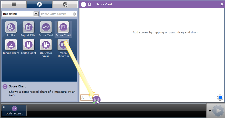
Flip the score card and drag the tool into the Scores area, or click the [Add] button to manually select it. You can also drag the Score Chart tool into the Workspace, over the Add Score tab. For example:
A new, blank Score Chart is added to the Score Card, which can be configured when the Score Card is flipped. For example:
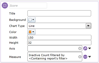
Add a Title for your chart and specify the following chart properties:
Chart Type: Select from Line, Column, Area or Pie.
Color: Select the color of the bars, line or area on your chart. This does not apply to pie charts.
Width: Enter the width of the chart in pixels.
Height: Enter the height of the chart in pixels.
To configure the chart axis, click on the drop-down at the end of the field to display the dimension configuration window, from which you can specify the range displayed on the axis.
Configure the measure by clicking the drop-down at the end of the Measure field. This displays the Measure configuration screen, from which you can select the required function and the source column.
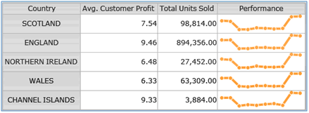
Flip the Chart to return to the Score Card workspace and view your configuration changes. For example, the following score chart displays a line graph to show the measure “Average Customer Profit” by the dimension “Half Year” to show a snapshot of the current performance trend. For example: